
When designing mobile games, one of the most frequently asked questions is “what size should I design mobile games at”. The answer can significantly impact both gameplay experience and performance. Here’s a quick summary to get you started:
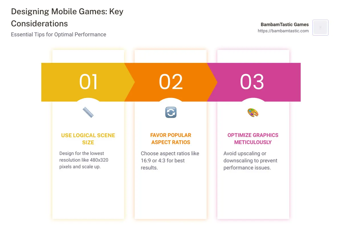
- Use the logical scene size that works on all devices. Design for the lowest resolution, such as 480×320 pixels, and scale up.
- Favor aspect ratios like 16:9 or 4:3 for best results across most devices.
- Optimize graphics carefully, avoiding upscaling or downscaling to prevent performance issues.
In today’s mobile gaming landscape, cross-platform development and user experience are crucial. Mobile devices vary widely in terms of form factors, from compact smartphones to large tablets. This variability poses a unique challenge: designing game elements to look good and run smoothly across all these devices. Without careful planning, you risk creating a game that feels clunky or laggy, especially on lower-end devices.
I’m Adam Degraide, and I’ve built businesses and developed games with a keen eye on mobile game optimization. My experience spans creating high-performance apps that cater to a range of devices. Understanding “what size should I design mobile games at” is key to delivering an engaging and inclusive gaming experience.
Understanding Screen Sizes and Resolutions
When designing mobile games, understanding screen sizes and resolutions is crucial. This ensures your game looks great and runs smoothly on any device. Let’s dive into the essentials.
Common Mobile Screen Sizes
Mobile devices come in various screen sizes, each with its own resolution. Here are some common ones:
- 360×640: Often found in budget smartphones.
- 414×896: Common in newer iPhones.
- 601×962: Seen in some high-end Android devices.
- 1280×800: Typically used in tablets and large-screen phones.
Knowing these common sizes helps you design a game that fits well on most devices.
Aspect Ratios in Mobile Game Design
Aspect ratio is the ratio of the width to the height of the screen. Different devices have different aspect ratios, affecting how your game appears. Here are some common aspect ratios:
- 4:3: Found in older tablets and some iPads.
- 3:2: Common in older iPhones.
- 16:9: Standard for many modern smartphones.
- 17:10: Used in some Android tablets.
Understanding these ratios helps you ensure that your game looks good on any screen.
Logical Resolution vs. Physical Resolution
- Logical Resolution: This is the resolution you design for, often the lowest resolution you want to support. For example, 480×320.
- Physical Resolution: This is the actual number of pixels on the device’s screen.
Designing for a logical resolution and then scaling up ensures your game looks good on all devices.
Content Scaling
Content scaling means designing your game for the lowest resolution and then scaling it up for higher resolutions. This approach ensures an equal gaming experience across all devices.
For example, if you design your game at 480×320, it can be scaled up to fit a device with 960×640 resolution without losing quality. This is known as the logical resolution.
Using frameworks like Felgo can make content scaling easier. Felgo automatically scales your game to fit different screen sizes and resolutions.
By understanding screen sizes, resolutions, and aspect ratios, you can design a game that looks great and performs well on any device. This sets the stage for creating an engaging and inclusive gaming experience.
What Size Should I Design Mobile Games At?
Designing for the Lowest Resolution
When designing a mobile game, start with the lowest resolution you plan to support. This is known as the logical resolution. For instance, many developers use 480×320 as their starting point. This approach simplifies the design process and ensures your game will scale up nicely on higher-resolution devices.
Content scaling is key here. Instead of rewriting your code for different screen sizes, you design your game once at the logical resolution. Then, you scale it up for larger screens. This way, your game looks consistent and performs well across various devices.
Using the Felgo framework can make this process seamless. Felgo’s Scene component handles scaling automatically. For example, if your game is designed at 480×320, it can be scaled up to fit a device with 960×640 resolution without losing quality. Felgo even allows you to access scale factors with xScaleForScene and yScaleForScene, in case you need them for custom adjustments.
Handling Different Aspect Ratios
Different devices come with different aspect ratios, and this can affect how your game looks. Here are some methods to handle this:
Letterbox: This method adds black bars to the sides of the screen to maintain the aspect ratio. It ensures no part of the game is cut off but can make the game look less immersive.
ZoomToBiggerSide: This scales the game to fit the larger side of the screen. It fills the entire screen but may crop out some parts of the game. This is often used for action-packed games where filling the screen is more important than showing every detail.
Non-Uniform Scaling: This method scales the width and height independently to fill the screen. It can distort the game elements but ensures every part of the game is visible.
Felgo supports these scaling mechanisms, making it easier to adapt your game to various aspect ratios. By understanding and implementing these techniques, you can ensure your game looks great on any device.
Next, we’ll dive into optimizing graphics for different devices to avoid blurry images and manage memory effectively.
Optimizing Graphics for Different Devices
Using Multi-Resolution Images
When designing mobile games, image quality and memory management are crucial. One effective way to handle this is by using multi-resolution images. This method ensures that your game looks sharp on all devices without consuming too much memory.
Instead of using a single large image, you can create different versions of your images: SD (standard definition), HD (high definition), and HD2 (higher definition). This way, your game can load the appropriate image size based on the device’s screen resolution.
Felgo makes this easy with its MultiResolutionImage component. This component automatically selects the best image version for the current device, optimizing both memory usage and image quality.
qml
 MultiResolutionImage {
 source: "images/balloon"
 ext: "png"
 }
By using this approach, you avoid loading unnecessarily large images on lower-end devices, which helps in managing memory efficiently.
Avoiding Blurry Images
One common issue in mobile game design is blurry images when scaling. To avoid this, follow these best practices:
Use High-Resolution Assets: Always design your assets at the highest resolution you plan to support. This way, when the game scales down for lower resolutions, the images remain crisp.
Optimize Memory: Using high-resolution images can be memory-intensive. To balance quality and performance, use the multi-resolution approach mentioned above.
Image Scaling: Ensure that your scaling mechanism preserves the aspect ratio. Felgo’s Scene component handles this automatically, but always test on multiple devices to ensure consistency.
By implementing these strategies, you can ensure that your game looks great and performs well across different devices. This leads to a better user experience and broader device compatibility.
Next, we’ll explore best practices for mobile game UI design, focusing on adaptive and responsive design techniques.
Best Practices for Mobile Game UI Design
Anchoring HUD Elements
When designing the Heads-Up Display (HUD) for your mobile game, it’s crucial to ensure that elements are anchored properly. This means they should remain in the correct position regardless of the screen size or resolution.
Using gameWindowAnchorItem: This component helps anchor HUD elements to the edges of the screen. For example, you can anchor your score display to the top-left corner and your lives indicator to the top-right corner. This ensures that these elements stay in place, providing a consistent user experience.
“`qml
Text {
text: “Score: ” + scene.score
anchors {
top: scene.gameWindowAnchorItem.top
left: scene.gameWindowAnchorItem.left
leftMargin: 5
}
}
Text {
text: “Lives: ” + scene.lives
anchors {
top: scene.gameWindowAnchorItem.top
right: scene.gameWindowAnchorItem.right
rightMargin: 5
}
}
“`
This approach makes sure that your HUD elements are always visible and appropriately positioned, regardless of the device used.
Designing for Different Screen Sizes
Adaptive Design: Your game should adapt to various screen sizes and resolutions. This means designing elements that can scale and reposition themselves according to the screen size.
Auto Layout: In tools like Figma, using auto layout can help create designs that automatically adjust to different screen widths. Instead of hardcoding dimensions, use flexible layouts that can expand or contract as needed.
Responsive Design: Implement responsive design techniques to ensure that your game’s UI looks good on all devices. This involves using relative units (like percentages) instead of absolute units (like pixels) for positioning and sizing elements.
Logical Scene: Use a logical scene that scales to fit different screens. Felgo’s Scene component helps by scaling the game’s content while maintaining the aspect ratio. This ensures that the game looks consistent across different devices.
Proportional Design: Keep your design proportional by ensuring that elements scale uniformly. For example, if you have a card with a 16px margin on both sides, use an auto layer that fills the width of the box and leaves 16px of space on both ends. This way, your design remains proportional even if the frame is wider or narrower.
Common Screen Sizes: Design with common screen sizes in mind. For instance, 360×640 is a common width for mobile screens. Designing for this size ensures that your game will look good on most devices. However, always test on multiple devices to ensure that your design scales well.
qml
 Scene {
 id: scene
 width: 480
 height: 320
 Rectangle {
 anchors.fill: parent.gameWindowAnchorItem
 color: "white"
 }
 }
By following these best practices, you can create a mobile game UI that is adaptive, responsive, and visually appealing across various devices. Next, we’ll answer some frequently asked questions about mobile game design sizes.
Frequently Asked Questions about Mobile Game Design Sizes
What size should I use for mobile design?
When designing mobile games, start with the lowest common resolution to ensure compatibility across all devices. A common baseline is 480×320, which ensures that your game will function on older or less powerful devices. From there, use content scaling to adapt your game to larger resolutions.
What is the best screen size for mobile gaming?
The best screen size for mobile gaming varies, but designing for a 1920×1080 resolution is a good starting point. This size works well for most modern devices, including large screen phones, which are increasingly popular among gamers. This resolution ensures that your game looks sharp and detailed on devices that support high-definition displays.
What size should I make my game?
When deciding on the size for your game, consider the following:
Desktop Displays: If your game will also be played on desktops, aim for a 1920×1080 resolution. This is a standard for many monitors and ensures that your game looks great on larger screens.
Mobile Displays: For mobile devices, design for a range of resolutions. Start with a lower resolution like 480×320 and use scaling mechanisms to adapt to higher resolutions like 1280×800 or 1920×1080.
Tablet Displays: Tablets often have larger screens and higher resolutions. Ensure your game can scale up to resolutions like 1280×800 to provide a good experience on these devices.
Large Screen Phones: These devices are becoming more common. Design your game to support resolutions like 414×896 to cater to these users.
Multitasking and Streaming: For users who multitask or stream games, ensure your game scales well on larger screens and can handle high resolutions without lagging.
Graphic-Intensive Games: If your game has high-end graphics, consider designing for the maximum pixels your target devices can support. This often means starting with 1920×1080 and optimizing from there.
By considering these factors, you can ensure that your game provides a great experience across various devices and screen sizes.
Conclusion
At BambamTastic Games, we strive to create mobile games that offer engaging and optimized experiences for players. Our journey began with puzzle games, which have been a hit among users for their unique gameplay mechanics and intriguing storylines.
Puzzle Games
Our puzzle games, such as “Find, Serve & Keep The Game,” stand out in the crowded app market. We continually refine these games based on player feedback to ensure a balanced and enjoyable experience. This focus on user experience has helped us build a loyal community of players who love our games.
Restaurant Empire
But we didn’t stop at puzzle games. We expanded our horizons with the Puzzle Restaurant, offering a unique dining experience that mirrors the creativity and innovation of our games. The restaurant is not just a place to eat; it’s a destination for those who crave an exceptional and private dining experience.
Special Upgrades
We believe in providing special upgrades and features to improve the gaming experience. Whether it’s through multi-resolution images or optimized graphics, we ensure that our games run smoothly on various devices. This attention to detail helps us minimize lag and improve overall performance, even on lower-end devices.
Excellent Service
At BambamTastic Games, excellent service is at the core of everything we do. From game development to customer support, we aim to exceed expectations. We listen to our players, make necessary adjustments, and continuously seek ways to improve our offerings.
By focusing on these aspects, we ensure that our games are not only fun to play but also technically sound and visually appealing. If you’re interested in learning more about how to design and make your own game app, check out our complete guide.
Thank you for joining us on this journey. Keep creating, keep exploring, and most importantly, have fun. Happy gaming from all of us at BambamTastic Games!